Construction
May 25, 2026
Brand Identity Evolution: The Shoal Bay Vision
Brand Identity Evolution: The Shoal Bay Vision

Brand Identity Evolution: The Shoal Bay Vision
In the high-stakes world of Australian residential construction, your brand isn't just a logo on a polo shirt: it’s a visual shorthand for your standards, your precision, and your commitment to compliance. At Shoal Bay Projects, we’ve always been about more than just project management; we are a strategic partner in the complex dance of building.
As we look toward the future, specifically the national target of 1.2 million new homes over the next five years, the need for elite, advisory-level consultancy has never been higher. To reflect this evolution, we are transitioning the Shoal Bay Projects identity from a traditional service-based aesthetic into a high-end, 3D architectural vision.
This isn't just a facelift. It’s a structural reinforcement of our brand vision: to be the gold standard in construction advisory.
Use the lighter Architectural Monolith render as the primary hero image and lead brand visual across the Shoal Bay Projects Webflow site.
Our logo has always featured the interplay between stylized building silhouettes and the coastal influence of the wave. In our new brand evolution, we’ve reimagined this mark as a physical, 3D architectural monolith.
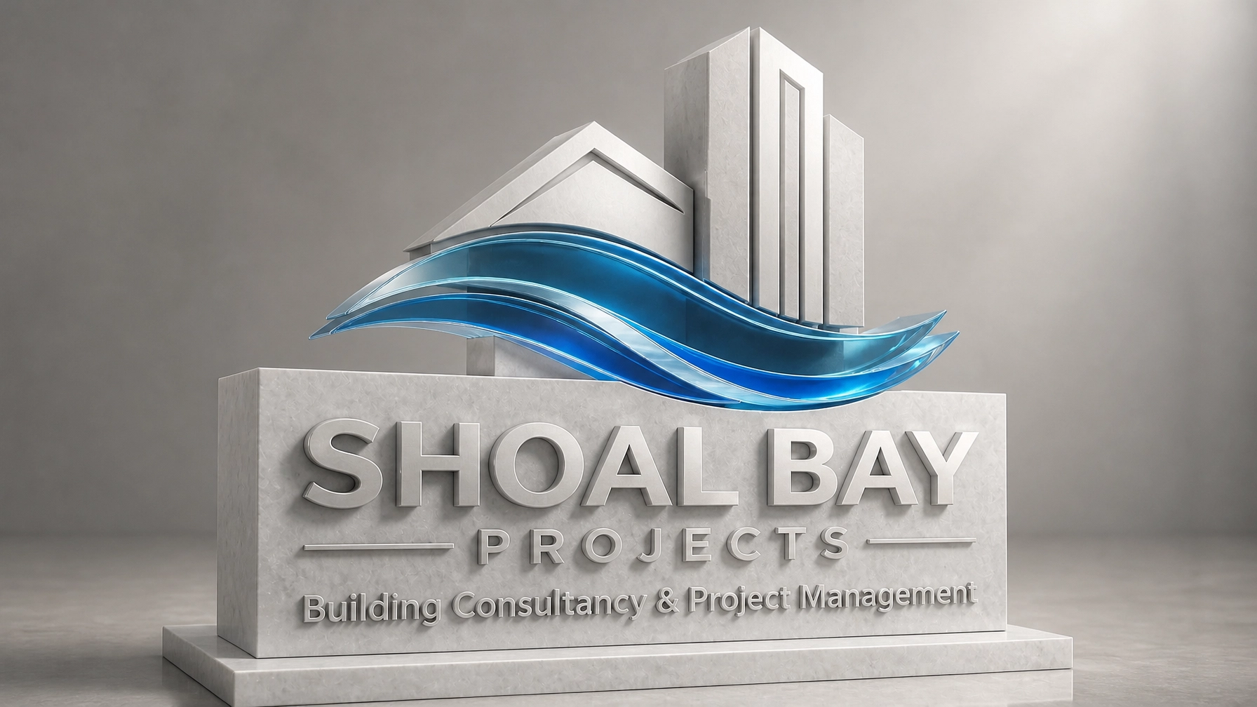
When you look at this render, you aren't just seeing a logo; you’re seeing the materials of our trade. The building shapes are crafted from light-grey architectural concrete and white Carrara marble: materials that still suggest permanence, strength, and structural integrity, but with a brighter, more refined presence. They represent the "bones" of a project, the adherence to AS 1684 (Residential timber-framed construction) and the rigid requirements of the National Construction Code (NCC) 2022.
At the base, the wave icon remains rendered in thick, polished translucent sapphire-blue glass. This stays as the focal point of the composition, anchoring the lighter palette with a clear sense of depth, movement, and adaptability. It represents the "fluid" side of consultancy: the strategic negotiation, the navigating of complex site conditions, and the responsiveness required when a project hits a snag. It’s the visual embodiment of our mantra: Solid foundations, fluid strategy.

Consultancy doesn’t just happen behind a desk. It happens on the ground, in the dust, and on the slab. However, for a high-end residential build, the visual cues on-site must reflect the quality of the work being performed.
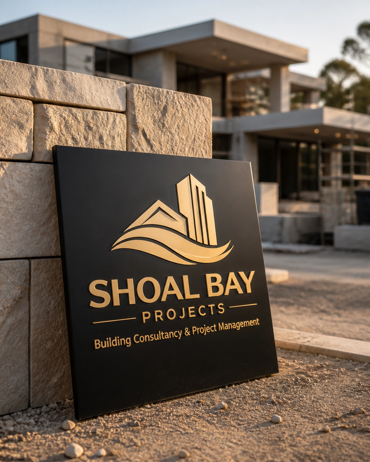
Our vision for site presence moves away from the standard Corflute sign. Instead, we envision sophisticated matte-black metal signage featuring the logo in champagne gold. When this leans against a luxury custom limestone wall, it sends a clear message to subcontractors and owners alike: This is a project where precision is non-negotiable.
By elevating the visual touchpoints on-site, we reinforce the authority of our compliance inspections. Whether we are checking for slab edge dampness or auditing waterproofing against AS 3740 (Waterproofing of domestic wet areas), the brand acts as a silent enforcer of the high-performance culture we bring to every project.
Strategic advisory requires a space for deep work and clear communication. Our brand evolution extends into the very environment where we meet with builders and investors to map out project risks and compliance strategies.
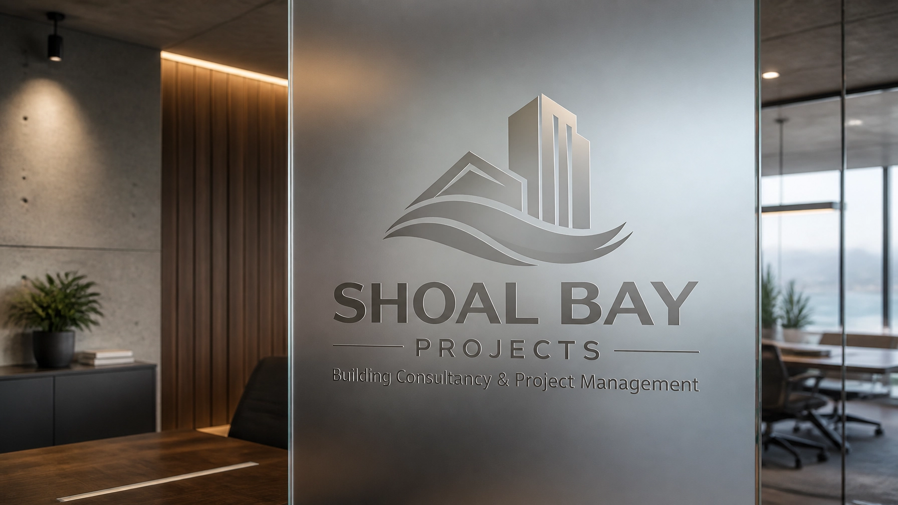
In our executive office concept, the Shoal Bay logo is elegantly etched into frosted glass. This isn't just for aesthetics; it symbolizes the transparency we bring to the construction process. Within a minimalist setting of polished concrete and warm timber, the brand feels grounded and modern.
This environment is designed for the high-level decision-making required for medium to high-end residential developments. It is where we interpret the complexities of the NCC and translate them into actionable project support.
You might ask, "Why focus on brand identity when there’s a housing crisis to solve?"
The answer is simple: Quality requires authority.
As Australia pushes toward massive housing targets, the risk of "speed over quality" is significant. The industry is currently grappling with:
For Shoal Bay Projects to effectively guide clients through these hurdles, our brand must command respect. An "elite" visual identity supports our advisory role by positioning us as the definitive experts in the room. When we provide a compliance interpretation or a risk management strategy, it carries the weight of a firm that understands both the art and the science of building.
In our technical posts, we often use a "forensic" visual style: detailed, 3D, and uncompromising. This brand evolution is the macro version of that micro-focus. By treating our own brand identity like a high-end architectural project, we demonstrate the level of care we apply to our clients' work.
Check your current project documentation. Specify the standards you want to hit. Document the deviations. And ensure your advisory partner has the vision to match your ambition.
We are building more than just homes; we are building a community of informed, compliance-focused construction professionals. We call this community The Hive, and it’s housed within The Vault: our central repository for technical knowledge and project excellence.
We invite you to explore this community hub and see how we are redefining the consultancy landscape.
Explore the Hive. Join the movement toward elite construction standards.